Raphael Leon – Product Design (Watch Series 3 of 3)
Raphael Leon – Product Design (Watch Series 3 of 3)
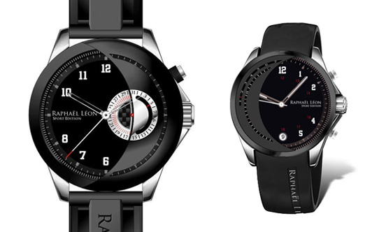
Our past experiences developing brand websites and product concepts for numerous watch companies, ultimately led us to design our first sports edition chronograph. Honored to even have this opportunity we set out to create something truly unique. Having initially drafted a few ruff ideas, we knew by our 4th concept we were onto something special…
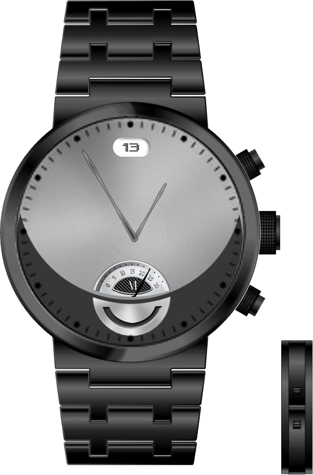
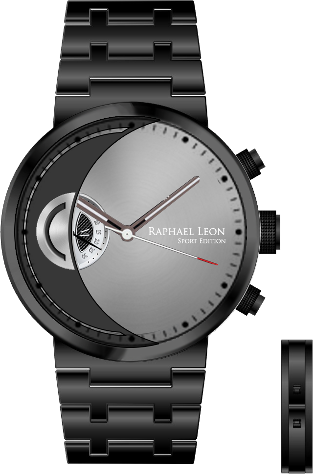
By splicing the subdial in half and overlaying a distinctive positive/negative color separation, we created a natural segregation to the dials surface area. Next we rotated the dial 45 degrees and placed the subdial on the left side of the bezel. Which resulted in a “crescent” die cut adjacent to the logo.
With a quick overlay of an existing Raphael Leon watch face and some minor color modifications to the hands and numerals; our first sports edition was born. From here we began drafting 4 finalized mockups: a blank face, a left and right version with contrasting marker patterns and finally a variation of the signature “crescent” for a more complex movement.
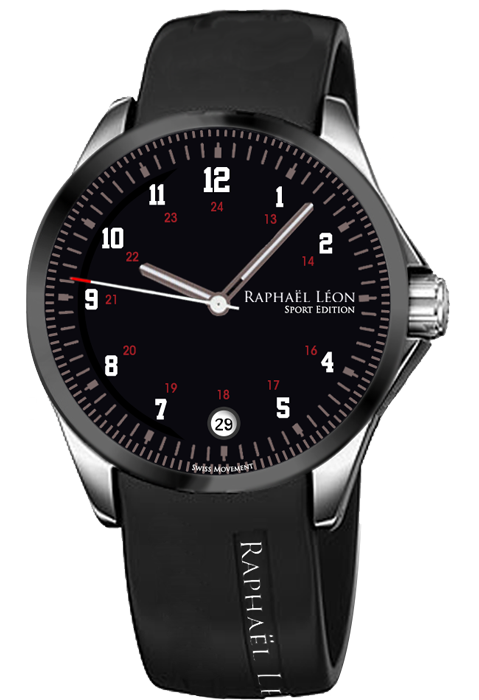
Once we received word from our client that our sports edition concept was approved, our designers began facilitating a full rendering for production. Complete specifications for strap, buckle, bezel, and crown were refined and rendered along with a finalized chronograph watch face.

After a successful few short months on the market our client commissioned an expanded line of women’s sport editions, based upon our original “crescent” design. With 32 styles for men and 38 for women get yours now at http://www.raphaelleon.com
Tags: Graphics, Product Design
