MLR Logo: Design & Guidelines
The not-so-simple path to achieving design simplicity.
After a few rounds of conceptualizing and tweaking the new MidLife Rises Logo is finished!
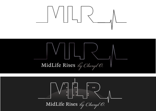
Drafting a logo has always been a fun yet tedious process. Often designers choose to neglect fundamental steps in order to meet a client’s given deadline or budget. These shortcuts can often lead to expensive corrections if the design is prematurely approved for trademark. Typically we create a minimum of 3 concepts – this may include any sketches or ideas the client themselves may have envisioned. With MidLife Rises (MLR), we drafted two conceptual and one more abstract mockup to showcase to the client. Once a favorable opinion was chosen, our concept began the next phase of development.
The not-so-simple path to achieving design simplicity.
After a few rounds of conceptualizing and tweaking the new MidLife Rises Logo is finished!
Drafting a logo has always been a fun yet tedious process. Often designers choose to neglect fundamental steps in order to meet a client’s given deadline or budget. These shortcuts can often lead to expensive corrections if the design is prematurely approved for trademark.
Typically we create a minimum of 3 concepts – this may include any sketches or ideas the client themselves may have envisioned. With MidLife Rises (MLR), we drafted two conceptual and one more abstract mockup to showcase to the client. Once a favorable opinion was chosen, our concept began the next phase of development.


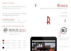
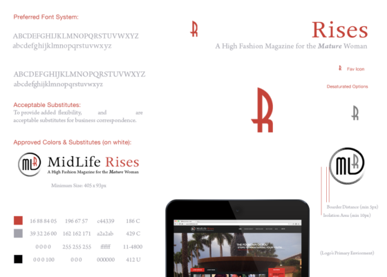
Generally the 3 most important elements to a logo are the typeface, color palette and artwork. If not set-in-stone, publishers and printers can often have a hard time reproducing your exact logo. As a result logos with “rectangular” backgrounds are printed, typefaces are replaced and artwork becomes illegible – faded, blotted or worse pixelated. In order for our design to comply with any medium, size or background our concepts must pass a stringent set of regulations within each core element:
- Typeface: min & max sizes, weight, kerning, font-family and suitable substitutes.
- Color Palette: CMYK, RGB, Web/Hex and Pantone.
- Artwork: min & max sizes, spacing, desaturated options and black & white backgrounds.
Once a concept is established and has met all the proper regulations above we place the logo in a real-world setting. By taking the time to see what the logo looks like inside its primary environment, we can make incremental adjustments to perfect its design. Though this may not seem vital at first, it was pivotal in the creation of MLR’s logo. Since our client is primarily an online publication and the website itself had already been programmed, it made sense to test our concept here. Having realized the “tagline” would shrink beyond legibility (almost 10px), we opted to revise our concept in favor of a previous mockup. Generally 10px would have been acceptable, but with the primary demographic being mature women – cramming type inside a websites header wasn’t going to cut it. What resulted was a cleaner, more simplistic, “icon” that would be easier to recognize at first glance and on darker/smaller spaces. What started, as just a quick sketch on a scratch piece of paper soon became a calculated, precisely illustrated, simplistic icon – though the path to getting there was anything but!


Final Approved Logo
