Lions & Lambs Logo Concept

Lions & Lambs Logo Concept
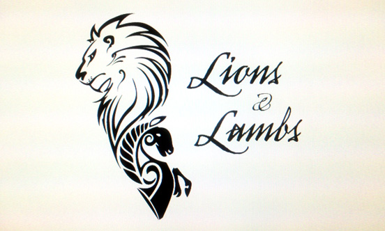
Crafting a logo to represent a cosmetics line geared towards men, is the kind of challenge we dream of. Our goal was to merge two worlds that previously did not coexist within the primary demographic.
Having tested the brands soaps, beard oils and balms first hand we quickly gained a sense of the rustic, potion-esq vibe the packaging and product portrayed. The name itself “Lions & Lambs” was of polar opposites, the direction seemed to manifest into a “yin & yang”. Positive & negative, black & white – after some quick sketches we began laying out our vectors in Adobe Illustrator.
The typeface was chosen to match an old era of handwritten calligraphy we hoped would invoke feelings of valor and chivalry, a complement to the story the name was derived from. The placement of the artwork adjacent to the text was versatile enough to be placed both horizontally or vertically to coincide with the various shaped packaging.