Exploring Responsive Web Design

Exploring Responsive Web Design
Optimize your audiences viewing experience and increase their interaction.
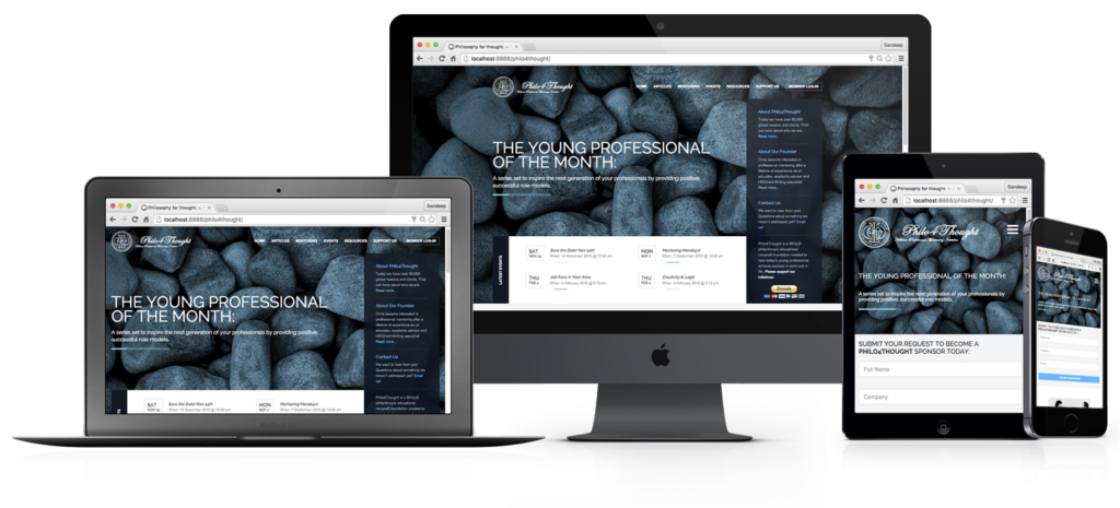
As the popularity of mobile devices continue to grow, so does the market of responsive web design. Responsive web design (RWD) is a programming approach aimed at crafting websites into an optimal viewing and interactive experience, regardless of the displaying device. Generally speaking this would encompass minimal resizing, panning and scrolling on the user-end.
At this point, you may be asking yourself is this really important? According to a survey by Google 48% of users said “if a website didn’t work well on a smartphone, it made them feel like they company didn’t care about their business”. While 62% of companies that designed a website specifically for mobile saw increased sales. To summarize, websites were originally programmed to load for desktop computers – resulting in those with tablets and smartphones to load a scaled (miniature) version of your desktop site. This often forced users into tedious operations like pinching-to-zoom, or excessive flicking and tapping. Even with scaled versions of websites 44% are rendered with difficult to inoperable navigation menus, while 46% suffer from off screen content and lengthy loading times. As of 2015 Google started severely penalizing a websites SEO ranking, in favor of those that meet its mobile-friendless standards. Today, less than 19% of websites adopt a mobile-first strategy. Many don’t have the resources to custom-code separate versions of their website (for phone, tablet and desktop respectively). But with proper planning and execution any businesses can develop a website using a CMS that supports RWD. Avoid unnecessary coding expenses by starting with a platform that includes a built-in modular framework. Stay ahead of the curve and cater to a larger demographic by optimizing your site to be mobile-friendly. RWD is proven to offer better brand engagement, increase conversions and drive traffic while reducing bounce rates. With a higher social-media referral rate and higher average-transaction values (than desktop) RWD for some, is the only choice.
Numbers Don’t Lie
- 60% of Internet Access Is Mostly Mobile.
- 32% of adults in the U.S. own an e-reader.
- 42% of adults in the U.S. own a tablet.
- Smartphone users check their devices 150 times a day.
- 70% of mobile searches lead to an action within the hour.
- 40% of mobile users will choose another search result if the one they land on isn’t mobile-friendly.
- 69% of tablet users have shopped via their tablet in the last 30 days.
- 67% of users are more likely to make a purchase with a mobile friendly site rather than a non-mobile optimized website.
- People using a desktop computer to search online increased from 1.4 billion to 1.6 billion users in 2015. While smartphone searches increased from 800 million to 1.9 billion in 2015.
- Users are 2x more likely to share content on their mobile device than on their computer.
Tags: Programming, UX Design, Web