Sansitas: Business Card Redesign
Sansitas: Business Card Redesign
Having started off as a small hobby in 2011, Sansitas grew to be a successful online ecommerce in just under 8 months. With that exponential growth came a natural evolution of the brands core style. It was only fair that the business cards themselves were updated to reflect the company’s newfound persona.
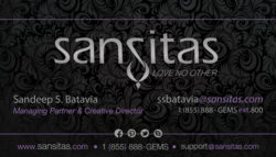
The original vertical design was created to directly reflect the brands first website. As a new company it was pivotal in establishing a consistent look across all branding mediums. With no regimented branding guidelines, elements such as textures, typeface, and color palettes were borrowed from the websites graphical user interface (GUI) for the first design. Though functional and affordable at launch, it seemed quickly outdated as the brand refined itself overtime.
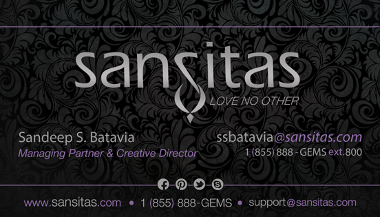
With the redesign, fancier printing techniques were fair game within the given budget. A thicker card-stock, UV coating and metallic foils seemed to portray a more accurate representation of the shiny, sparkly, chic jewelry. Their expanding social media presence along with updated information required additional space, justifying the change from portrait to landscape. What resulted was a graceful, sophisticated, high-end business card that was not only more durable but cohesive to the brands evolved personality.
Sansitas: Business Card Redesign
Having started off as a small hobby in 2011, Sansitas grew to be a successful online ecommerce in just under 8 months. With that exponential growth came a natural evolution of the brands core style. It was only fair that the business cards themselves were updated to reflect the company’s newfound persona.
The original vertical design was created to directly reflect the brands first website. As a new company it was pivotal in establishing a consistent look across all branding mediums. With no regimented branding guidelines, elements such as textures, typeface, and color palettes were borrowed from the websites graphical user interface (GUI) for the first design. Though functional and affordable at launch, it seemed quickly outdated as the brand refined itself overtime.
With the redesign, fancier printing techniques were fair game within the given budget. A thicker card-stock, UV coating and metallic foils seemed to portray a more accurate representation of the shiny, sparkly, chic jewelry. Their expanding social media presence along with updated information required additional space, justifying the change from portrait to landscape. What resulted was a graceful, sophisticated, high-end business card that was not only more durable but cohesive to the brands evolved personality.